Corporate design project for the finance app Fabit.
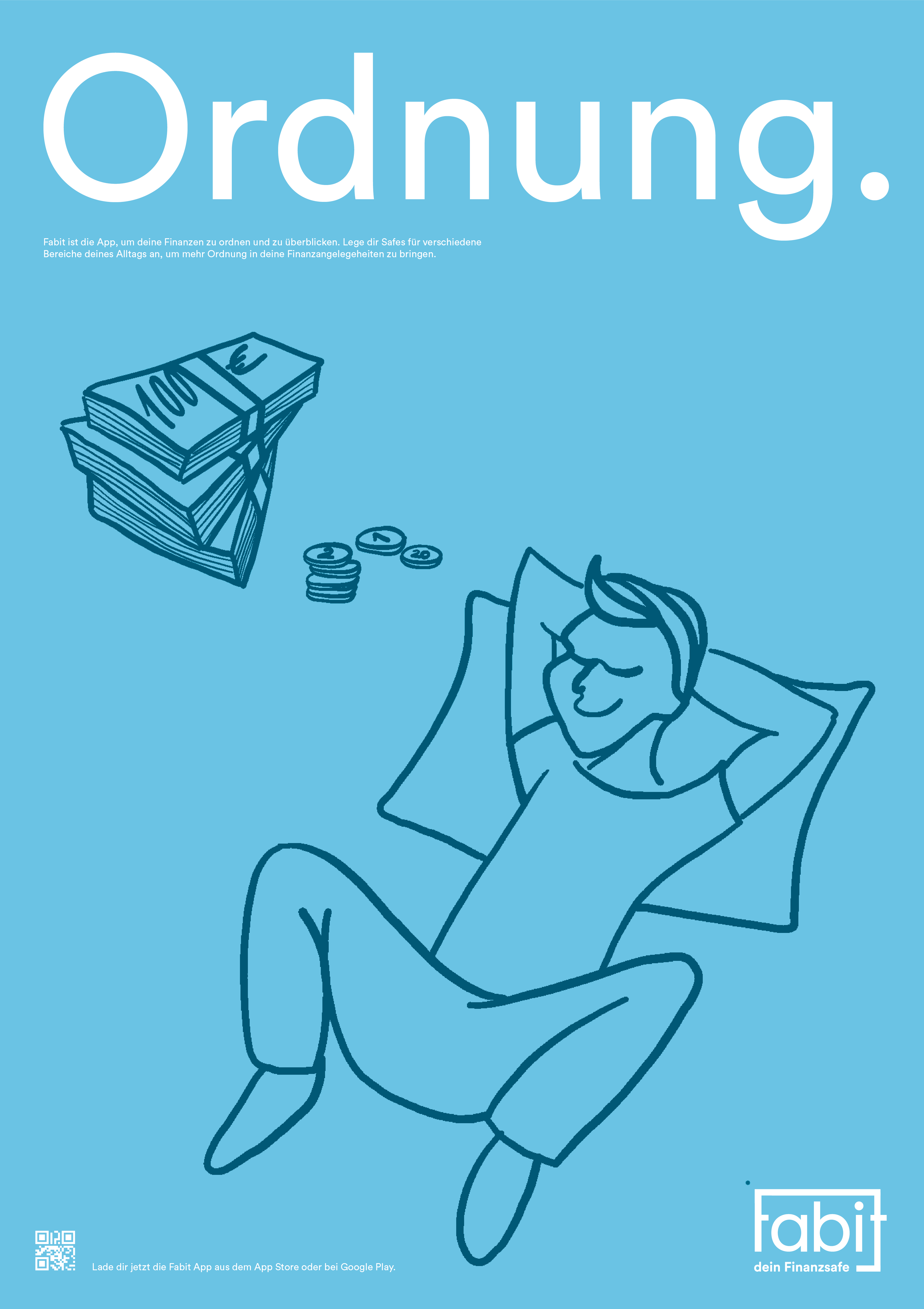
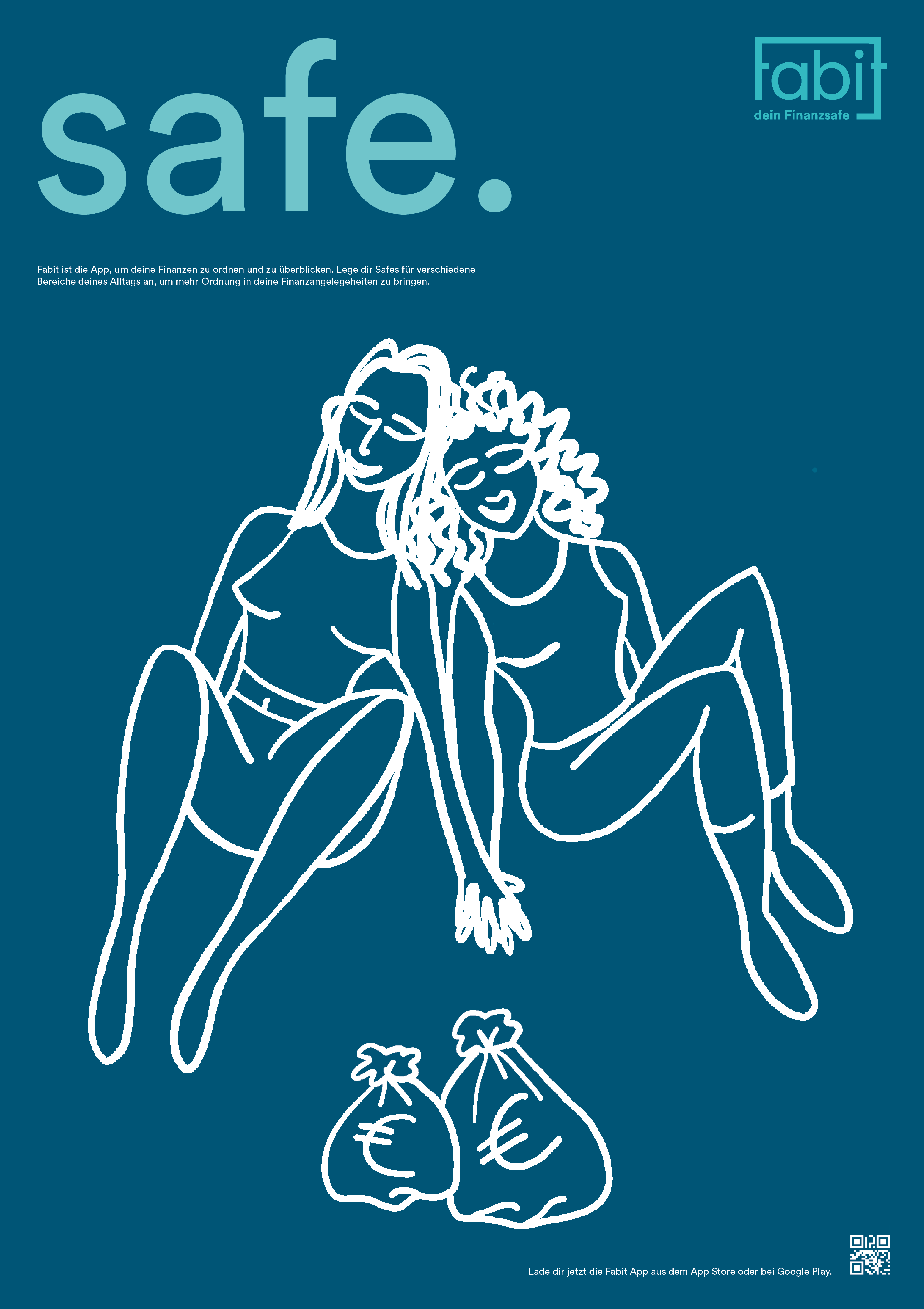
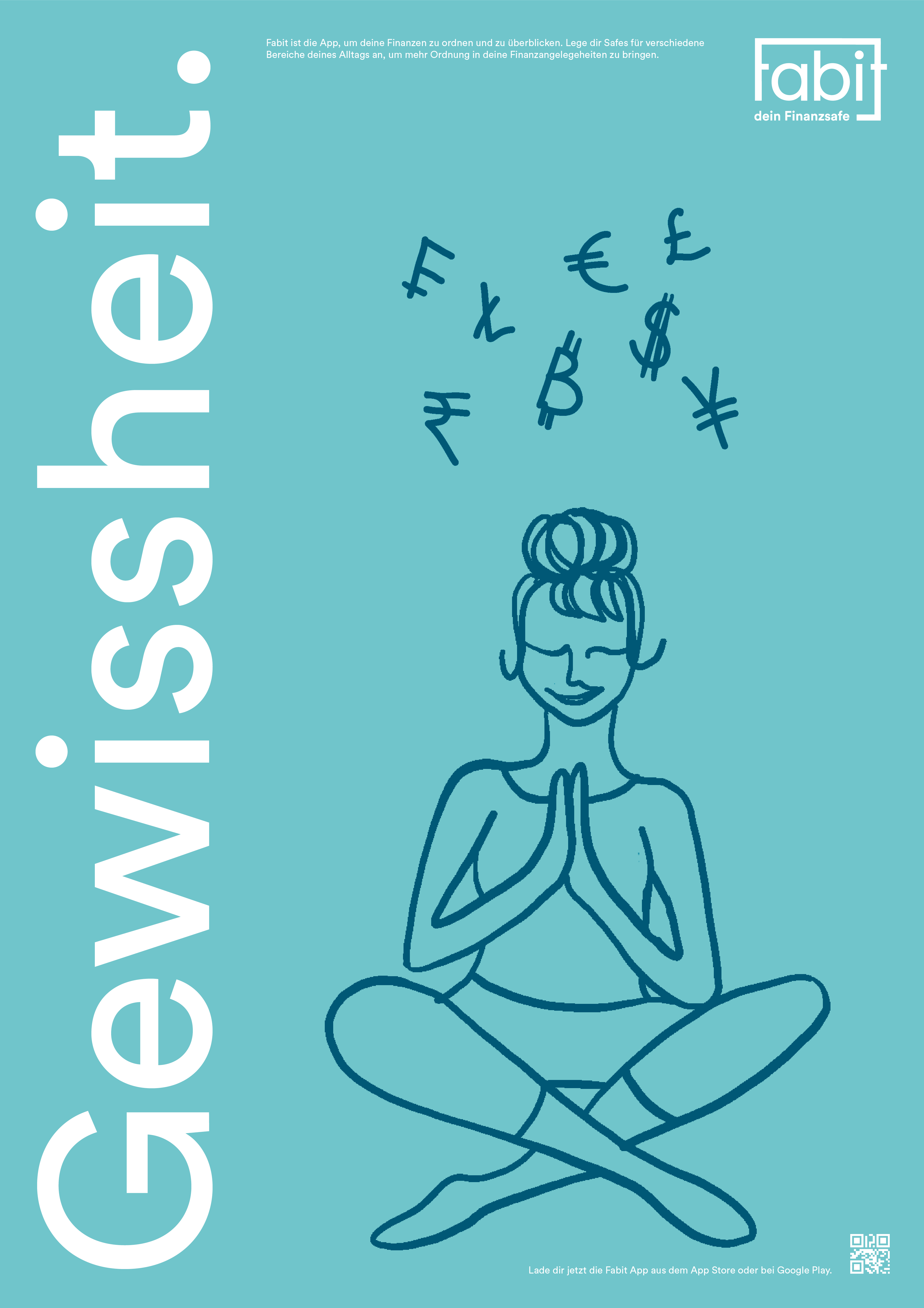
This is a corporate design project for the finance and savings app Fabit. Fabit was founded by Dr. Ralph-Michael Schmidt, Susanne Krehl and Robert Leim. Within my Corporate Design Course at University, we were supposed to come up with individual concepts to bring Fabit to the next step of their business and freshen up the look and feel of the app.
Starting with a brand evaluation and competitor analysis, I first determined Fabits current state, core message, audience etc., in order to find a start in deciding their target status. This I began by specifying Fabits brand philosophy as being an app for making finances something accessible and comprehensible, for an audience that feels overwhelmed by money related habits and decision making. The core message that I want Fabit to convey is order, better understanding and safety of finances. Which Fabit is supposed to provide by a clearly displayed structure of the app, as well as helpful expertise that is not intimidating but rather supportive. By this, Fabit helps to convey a peaceful and relieved state of mind.
This I achieved by applying a structured, clear, comprehensive and reliable design language. Through bold fonts and relaxed and trustworthy appearing color combination of different blues and petrols.
After determining the key elements and design language, I moved on to logo design. For this I brainstormed different symbols for the core message I wanted to convey, which were a safe, a padlock, a relaxed smile, two protecting hands, tidy stacks of documents or files etc. First, I focused on designing a logo around the padlock idea, with the padlock as the „a“ in „Fabit“. This worked great visually, however locks can convey a feeling of being trapped or locked up, which is quite the opposite of what I wanted Fabit to stand for. This is why I then followed my idea of the safe, which also cooperated nicely with my claim and the functional layout of the app, which I will both talk about later. You can see the logo at the very top of this page, as well as on all print media.
I came up with the claim „dein Finanzsafe“ as a description of what Fabit really is, as the companies name and my poster design are not sufficient enough to make clear to the beholder what Fabit actually even is. Furthermore, I determined headlines for all print media which take over the job of giving the emotional connection the beholder needs in order to be personally interested in Fabit. These headlines you can see on the poster series above.
I developed an abundance of digital illustration to further support the emotional connection between Fabit and their target audience. These Illustrations radiate relaxation, peace of mind and the feeling of letting go of stress.
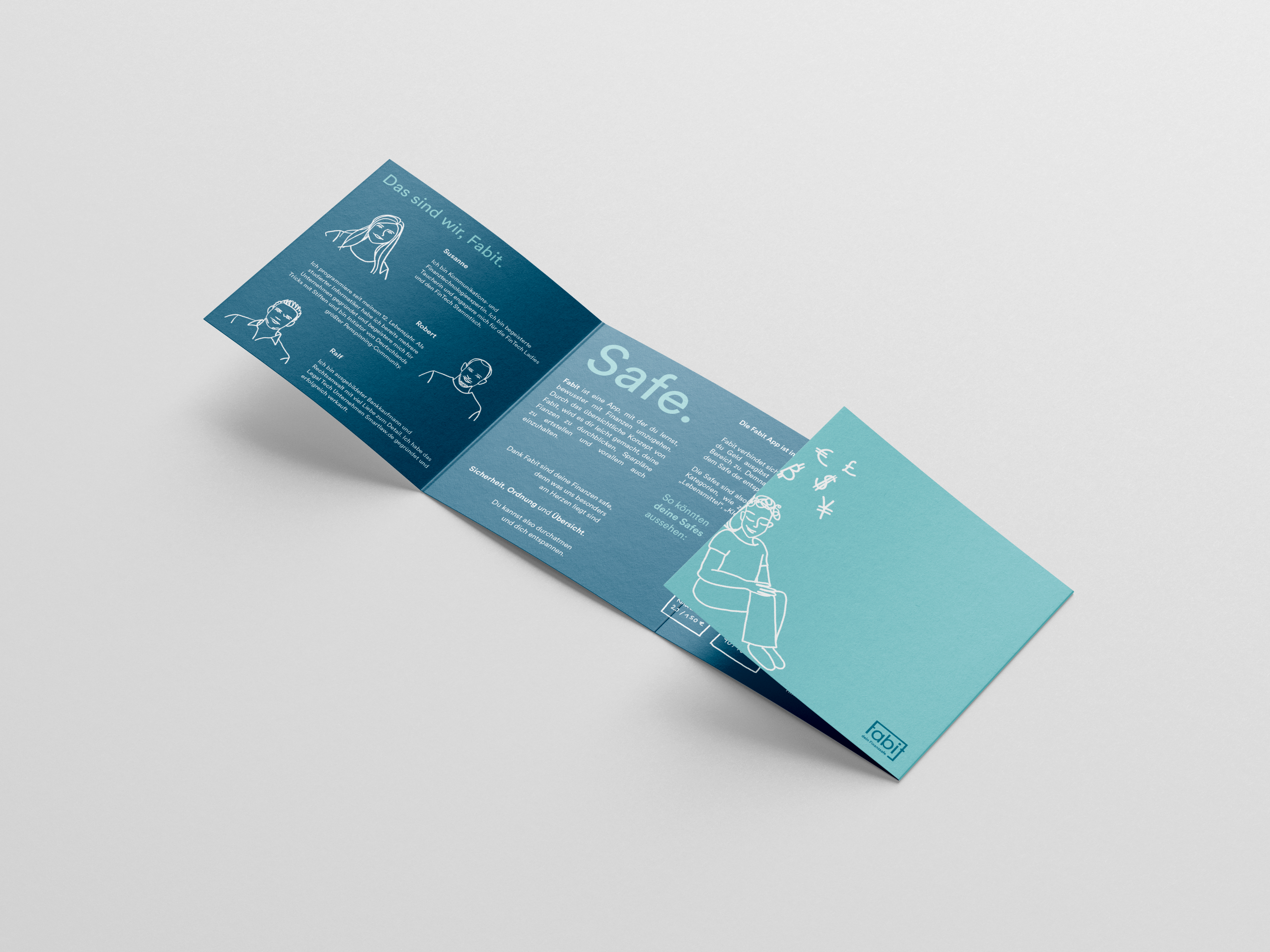
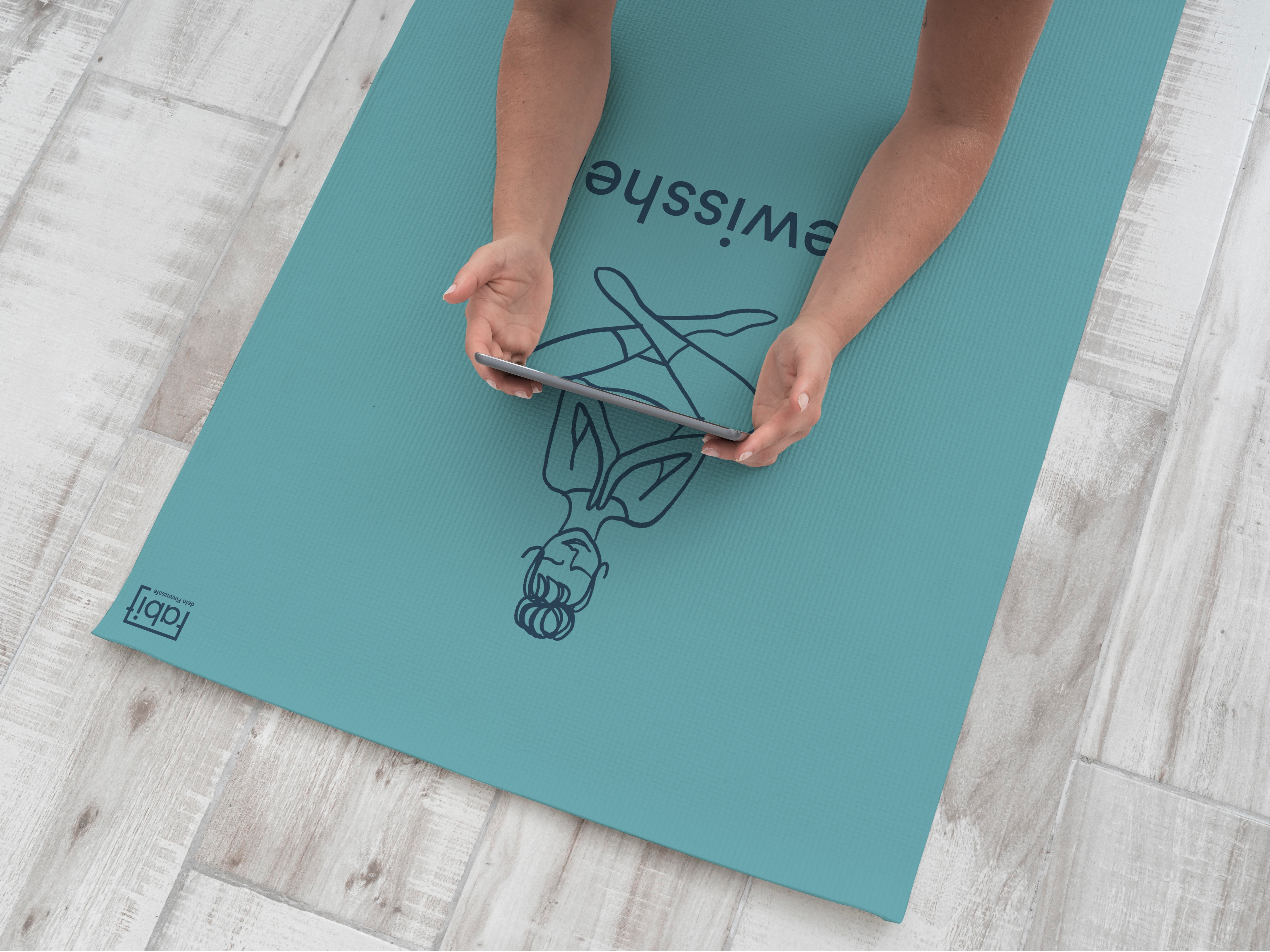
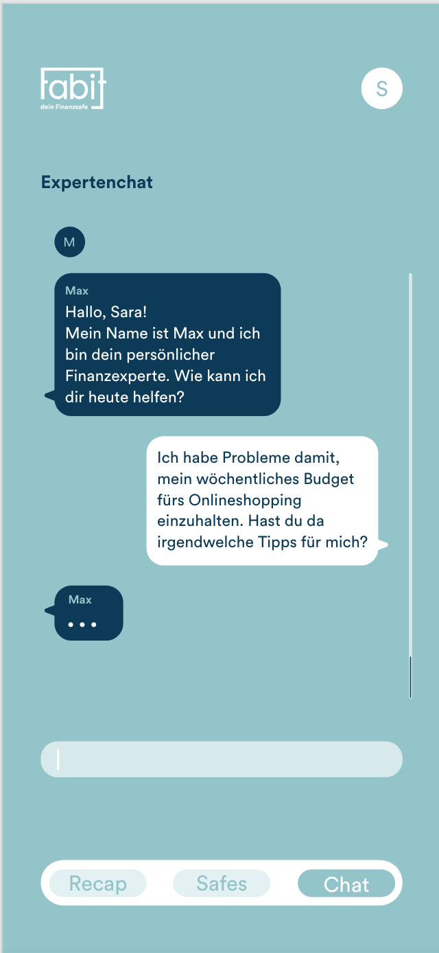
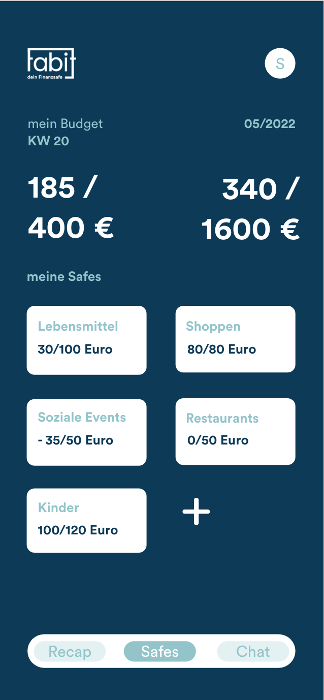
With all of my design elements I not only created the three part poster series but also a booklet, which you can see a mockup of below, a giveaway, consisting of a yoga mat, which in turn connects to a guerrilla marketing strategy of yoga and meditation workshops. I also developed several of the app screens for Fabit within Adobe XD as well as Protopy, which you can see a run through of on this page, too. I structured the pp into different safes, which contain different categories that you may want to safe money in. The app also contains an expert chat function, in order to provide answers for any questions concerning financial habits.
